Sunday, 15 February 2015

Makers Dozen

1. Denby Dinnerware: A Firm Favourite.
Denby Pottery was established in 1809 in Derbyshire, and have since been producing outstanding pieces for over 200 years. Denby tableware has a fantastic, rich heritage, they also use locally sourced clay for their creations. Their pieces are durable and most importantly, beautifully British.


2. Hunter Wellies: Reminiscent of days with the ponies.
Hunter is a British heritage brand renowned for its original boot. Established in 1856, this brand has had a rich history – including commissions for soldiers’ boots from the War Office in both World War One and Two. Most of my teenage years were spent at the farm with my sorely-missed Polly and Sherry, in a pair of classic green Hunter boots. 


3. Emma Bridgewater:
Emma Bridgewater's brand began in 1985. At the factory in Stoke-on-Trent, local clay is used and most of the work is still done by hand. This brand have unique recognisable forms and prints and have filled a gap between decorative and functional. I'm lucky enough to own a personaised Emma Bridgewater teapot, which was a 21st gift from my Dad. 


4. Wedgwood:
Over 250 years of history make Wedgwood one of England’s most iconic brands. During this time Wedgwood have catered for royalty as well as average families all over the world. Wedgwood tableware is classic and will stand the test of time – truly inspiring. 


5. Burleigh:
Another historical brand. Established in 1851, Burleigh has been producing pure English ceramics for over 150 years. Their blue and white surface pattern is iconic and for me, screams British. 


6. Cambridge Satchels:
The Cambridge Satchel Company was founded in 2008 in Cambridge, England. They are durable and timeless and remind me of bygone times. 


7. Flux Stoke-on-Trent:
Flux is an innovative ceramic design company and joint venture with Staffordshire University. This group of designers are a breath of fresh air and are aiming to revitalise the UK’s ceramic industry. Traditional blue and white with contemporary touches, I just love it. 


8. Jack Wills “Fabulously British”:
Jack Wills began in Devon in 1999. They design heritage inspired clothing and accessories inspired by our history, tradition, culture and everything “Fabulously British.”


9. Bird’s Custard: Tea time at Grandma’s.
This custard made the Bird’s brand famous. Since 1837, Bird’s custard has been loved by generation after generation and was also supplied to our armed forces in World War One. This brand is reminiscent of Sunday dinners at my Grandma’s house. 


10. Clare Hillerby:
A local jeweller, based at Manchester Craft and Design Centre. Her one-off pieces are made using discarded ephemera and are simply beautiful. 


11. Pimms:
Another traditional British favourite and it all began with a farmer’s son in Kent. A classic, British summer-time treat and most importantly, it is delicious. 


12. Cath Kidston: 
Wonderfully British, based on country traditions, childhood and nostalgia. Buying something from this brand is always heart-warming and the shops, the products and the even the packaging simply make me happy. 


13. Katie Almond Ceramics: My ultimate inspiration.
Made in Leicester, Katie Almond’s range features quirky cast porcelain pieces, which she uses as a canvas for painting, illustrating and collaging. Katie’s work celebrates what it is to be British, drawing upon our wonderful history through her nostalgic themes. I am lucky enough to own one of Katie’s porcelain jugs and it will always be an item I treasure. 


Monday, 12 January 2015

Rusty pots

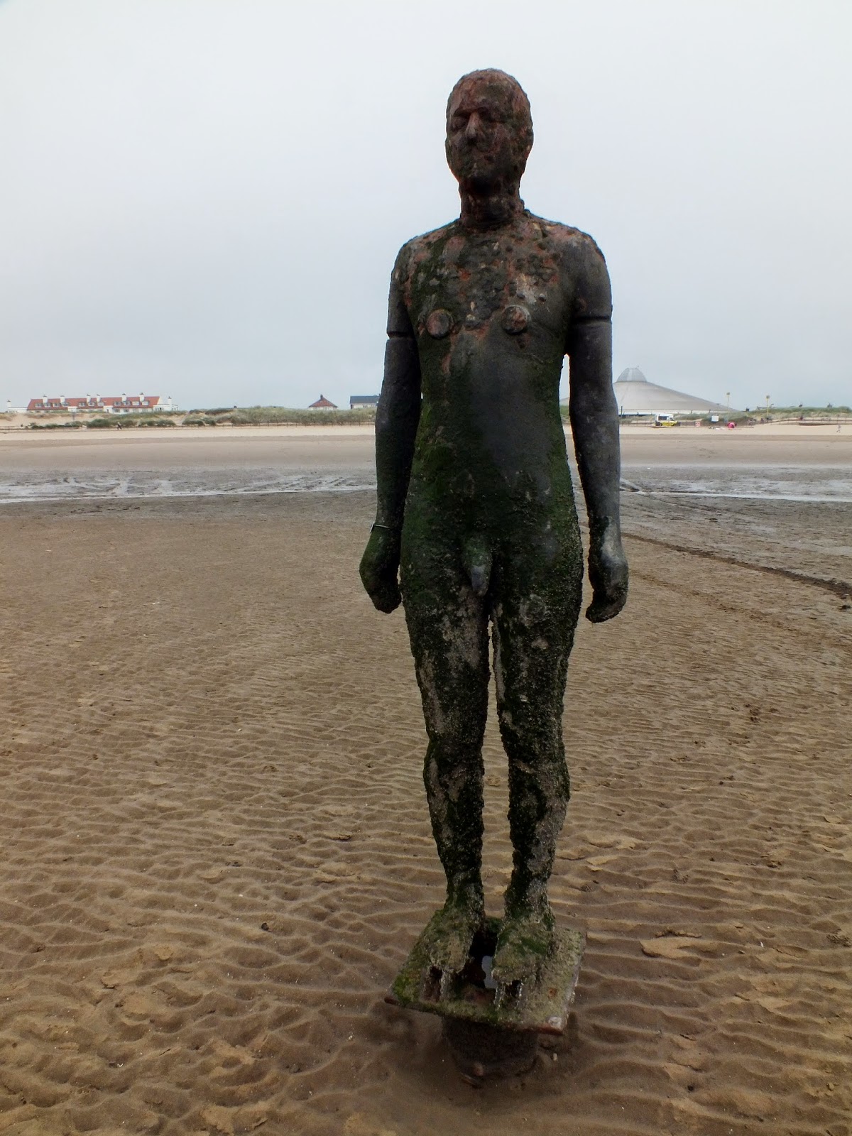
A lot of my current designs are involving rusty ceramic surfaces which I create using slip, underglaze and a lot of iron oxide, which is essentially rust. These designs have been inspired by numerous photographs of rusty surfaces created by the sea - mainly from the Iron Men at Crosby beach. 


Here are some experiments I've been working on recently. I think they need more work than the pieces I've posted previously, which were inspired by barnacles. I'm not unhappy with these experiments but I can certainly see ways of improving them. 


At the moment, I'm finding the oxides to be a bit unpredictable and this has meant some of my results haven't come out quite as bold as I'd imagined. For instance, the piece above is a very toned down colour scheme compared to what I'd designed and anticipated. Anyone studying ceramics expects these kinds of hiccups, so thankfully these results haven't been too discouraging. 


Although some of the surfaces weren't what I originally had in mind, I've got ideas on how to improve the problems and will have a busy few weeks making more vessels and testing things such as heavier applications of slip and oxides. 

Portobello Beach, Edinburgh

Recently, I spent a weekend in Edinburgh. We visited endless galleries as well as vintage and antique shops, so generally, the trip was really inspirational. 


Being a lover of the sea, I spent a morning at Portobello beach which is along the coast of the Firth of Forth. The beach has several prominent wooden groynes, which are designed to stop erosion. On these I found some fantastic, really beautiful natural surfaces - mainly rust and barnacles created by the ocean. 


I'm currently using these images in my design work and creating pieces inspired by them. The surfaces are so rich and interesting, I've got endless things to test and try out. Here's a sneak peak from my sketchbook, showing just a few ideas and how I've used the photographs to influence my designs. 


I'm really enjoying the design process, combining the eroded surfaces with my family photographs and trademark nostalgic imagery from the Great British seaside. I'm looking forward to doing more tests with slip, oxide and underglaze and getting some pieces made which were inspired by my visit to Scotland. 

Glaze, oxide and underglaze...

These are the pieces from my last post. They have now been glazed and covered in oxides to help create an decayed surface, inspired by erosion from the ocean. 


Generally, I'm really happy with these results. Some need a bit of refinement, especially with the (bright blue) cobalt oxide. I will definitely be using more copper oxide (green) to create more natural shades and to stop the blue being quite as striking. 


Opening a kiln in sometimes really nerve-wracking so I'm really happy to have some tests I'm pleased with, finally! I'm excited to create these surfaces on larger vessels and refine all of the techniques I've experimented with. 


If you're interested in adding colour to ceramic surfaces or just want to know more about the processes involved, here are some useful, informative links:  


Saturday, 10 January 2015

Test tiles to vessels...


A few results I'm happy with and want to develop


I've started to use the successful techniques on small test pieces


Bisque fired vessels -
I'm excited to see the surface results after oxides, underglaze and glaze have been applied


Seaside Erosion

These images show part of my current design process, which originated from some photographs I took at Crosby Beach, otherwise known as "Another Place" by Antony Gormley. "Another Place" consists of 100 cast-iron, life-size figures stretched along the coastline and into the sea.


The pieces explore man's relationship with nature - tested by tide and time. The "Crosby Iron Men" are a permanent feature on the beach, constantly exposed to all weather conditions, light and the ocean. They are ever-changing and at the sea's mercy, which has resulted in beautiful natural surfaces covering the cast-iron surface.

The Iron Men are spectacular as an installation, but what makes them inspiration to me is how the sea has made each one unique. They began as 100 identical sculptures and now each one is beautiful in its own right, constantly changing season by season and in different lights.

A close-up I took of one Iron Man's surface

Oxides and underglaze before the glaze firing

Bisque fired tile with texture and coloured slip

Oxides and underglaze added

The finished test tiles

The images above show some tests I've been working on and now intend to develop onto vessel forms. These experiments were all based on the close-up photograph of one of the Iron Men. I'm currently exploring ways to create eroded textures on ceramic surfaces using coloured slips, underglazes, oxides and glazes. I'm really excited about some of the techniques I've discovered this semester and can't wait to perfect these on my slip-cast forms. 

Saturday, 29 November 2014

September to November...

The first semester of my final year is almost over and I've started to reflect on the past few months - time to get up to speed with what I've achieved since September.

At the start of my third year, it seemed as though everything I've been working for had reached a crucial point - a point I'd been desperate to get to so I could finally work to my own briefs... With the benefit of hindsight, it wasn't really surprising that I had absolutely no idea where to start. There were too many projects, too many things I wanted to run with and too many things I wanted to design. My problem every time - how do you commit to just one idea?

Thankfully, a short 'kick start' project brief was handed to me - a lovely distraction from the stress of writing my own breif. I was required to pick a square metre of any surface and produce a piece which would fit inside a 50cm square box.


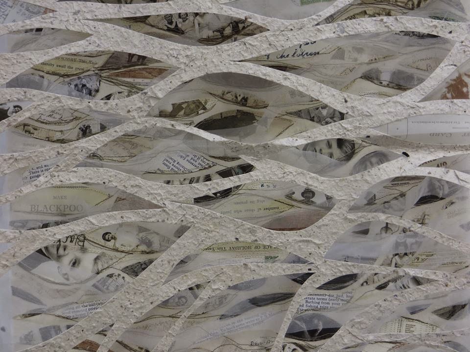
As a slight coast obsessive, the beach was my first port of call. On this beautiful, autumn day, I found that I was captivated by the formations the sea left in the sand. True to my sentimental-self, I sat and wondered about the amount of history Blackpool's beach really had. Ever-changing, the sand has fascinating qualities, but it has also carried decades of history. 


Local beaches (Blackpool, Southport, Morecombe, Formby) were where my Grandparents went on ritualistic family holidays. The photograph above is such a precious image for me - my Grandma and her sister standing on the sand, adding a story to the rich history of  the British seaside. I wanted to find a way to capture the beauty of the physical layers of sand I photographed and the metaphorical layers of history and narrative, too. It was also really important for me to include personal aspects though my Grandma's photographs, which often feature in my work. 


This was my result - a layered textile and paper piece which I suspended to allow movement between the layers. The length of the project meant that working in clay wasn't really practical and even though I longed to do something familiar with a material I love, working with stitch was really interesting. I designed the first layer to be very visually rich - a textured surface brimming with treasured ephemera and old photographs. Gradually, these visual aspects fade out - reflecting the reality for seaside towns like Blackpool. It's hardly a top-tourist spot these days.  


The decline of seaside towns in the UK is something that's provoked my ideas in the past. At the time, I didn't realise that a piece I wasn't too pleased with would be a major stepping stone in my current design process. 

Thursday, 27 November 2014

The future of Craft education.

At the moment, I am working on my dissertation which will explore how ceramic education can be secured for future generations. I'm looking at the current state of ceramic education and exploring some of the possible reasons why ceramics courses are becoming seemingly less popular and certainly less available. 

Recently, the future of ceramic education has been thrown into doubt. The last decade has seen the majority of higher education ceramic courses closed or adapted into more general 3D or craft programmes. Not only this, with major changes to undergraduate fees in 2012-13, students are now faced with paying £9000 per annum. With all of these changes affecting prospective students, it is not surprising that ceramics is increasingly becoming a niche higher education market. 

My last blog post was written about the ceramic poppies at the Tower of London and how they have captured the public's attention and imagination. People were discussing ceramics in a positive way and I felt like finally, ceramics was getting the public recognition it deserved. However, on November 5th 2014, Falmouth University announced the closure of its Contemporary Craft degree. Ceramics was back in the news, but for negative reasons. Perhaps it's just me who thinks this is slightly ironic... 


This decision has caused dismay for students (shown protesting above) and the creative community, not just on a local level, but nationally too. 
The announcement has also come at a time when the Crafts Council have released information regarding their plans for the future of craft education in a recent publication, “An Education Manifesto for Craft and Making."


These visions and plans fill me with optimism for the future of my practice, yet the closure of another course with a ceramic element brings me back down to earth with a somewhat cynical bang. 

Thankfully, yesterday some of my optimism was restored when I visited a local school which took part in the Craft Council's "Firing Up" scheme. The project aimed to "re-fire" dormant kilns in the UK's secondary schools by teaming them with local Universities. UCLan, where I study was involved and this project is something which a lot of my dissertation research has been about. Yesterday, I met with the Head of Art who specialised in ceramics when he was at University. I interviewed him about the "Firing Up" scheme and his general thoughts about the future of ceramic education. 


The ceramic work from the school was generally fantastic. Seeing the classrooms lined with clay creations (such as the one shown above) was so encouraging. But there was one particular thing I was drawn to - a collection of work from a student who is visually impaired. This particular student was desperate to do art - being able to use clay has made this possible for him. He is the first pupil at the school to study for a ceramics GCSE. Some of his beautiful, tactile pieces are shown below.


I have aspirations to teach and currently, the future of the career I aspire to is in doubt. It was so inspirational and amazing to have my passion and love for a subject reaffirmed by another student. This, for me, truly confirms that is it fundamental for ceramics and crafts subjects to remain part of any education. 

To support Falmouth University's Contemporary Craft course, please take the time to sign this petition opposing the closure:
https://you.38degrees.org.uk/petitions/oppose-falmouth-university-closing-the-contemporary-crafts-degree


To read more about the Craft Council's Education manifesto, check out this link:
http://www.craftscouncil.org.uk/what-we-do/education-manifesto/

Finally, if you're interested in learning more about the success of the Craft Council's "Firing Up" scheme, this video is a must-see:


Saturday, 18 October 2014

"Blood Swept Lands and Seas of Red"

This major and current art installation, Blood Swept Lands and Seas of Red at the Tower of London, marks one hundred years since Britain's first full day of involvement in the First World War. 888,246 ceramic poppies - each representing a British military fatality during the war - will progressively fill the Tower's famous moat. 


The first of these flowers were planted on August 5th 2014, one hundred years since the first full day of fighting in the war. The last one will be planted on November 11th - Remembrance Day.

The iconic red poppy is a symbol of remembrance because in Western Europe, it is the first wildflower to appear when soil is disturbed. So after the war, the fields where soldiers fell became large regions of crimson blooms. For me, this idea somewhat reflects the installation – something beautiful and symbolic arising from tragedy. The name of this installation is also symbolic - originating from a poem written by an anonymous soldier in World War I: "The Blood Swept Lands and Seas of Red."

The ceramic poppies were designed by artist Paul Cummins, who worked in collaboration with stage designer Tom Piper who was involved with the installation process. Cummins has become well known for his energetic ceramic flowers and vibrant glazes, combined with the raw presence of steel and wire. Piper is a British theatre designer. Each poppy was handmade by a team of volunteers in Derby and Stoke, working around Paul Cummins’ concept.


This video shows the making process of the ceramic poppies. Like many hand-building projects, the clay was cut and rolled into large flat sheets using a traditional ceramic rolling mill. A metal stamp (like a large cookie cutter) was used to cut petals from the sheets of clay, which were then paired together to form six overlapping petals.


The petals were then individually moulded by every artist to create the shape of the flower. I love this part of the making process because even though the makers were required to use one uniform cutting technique, the moulding by hand allows each poppy to be completely unique – not only in its appearance but also through its maker. I feel that this intimacy and interaction gives each poppy a background – a story within a story, making up this vast commemorative piece.


The poppies were then finished with a weatherproof, red glaze and assembled with metal and rubber components, ready to be ‘planted’ on site. Although the glaze is resilient, the intention is that each poppy and its metal stem will rust, weather and begin to look more natural after three months braving the British outdoors – adding yet another level to each piece’s individuality and narrative.


I really like that this piece is always evolving. It is currently in the process of a gradual installation at the Tower of London and once the poppies are removed from the site, they will be sent to new homes nationwide. The poppies have been available to individually purchase for £25, which will raise millions for six charities, one example being Help for Heroes. This idea means that each poppy will continue to be a symbol of remembrance all over the country for years to come. The longevity of ceramics is hugely significant and will allow these poppies to be treasured items for decades.


As a ceramicist, history lover and a bit of a World War obsessive, this piece is a dream come true. It successfully and intelligently commemorates a vital part of Britain’s history and I admire that a traditional craft like ceramics was the chosen material. Crafts such as ceramics are often misunderstood disciplines, so to use clay on such a large scale is really inspiring. Ceramics in the press and public eye can only be a positive thing for designer makers in this field.

As well as celebrating a practice I am passionate about, this huge project holds some personal significance because my Great, Great Grandfather was one of the 888,246 military fatalities during World War I. On Monday 18th August 2014 the name of James Gregory, Loyal North Lancashire Regiment was among the list of one hundred and eighty names read from the Tower moat at sunset (you can see this two minutes into the video below). This personal connection to the piece is something I am sure to share with many others nationwide, adding yet more significance to an already symbolic piece of art.